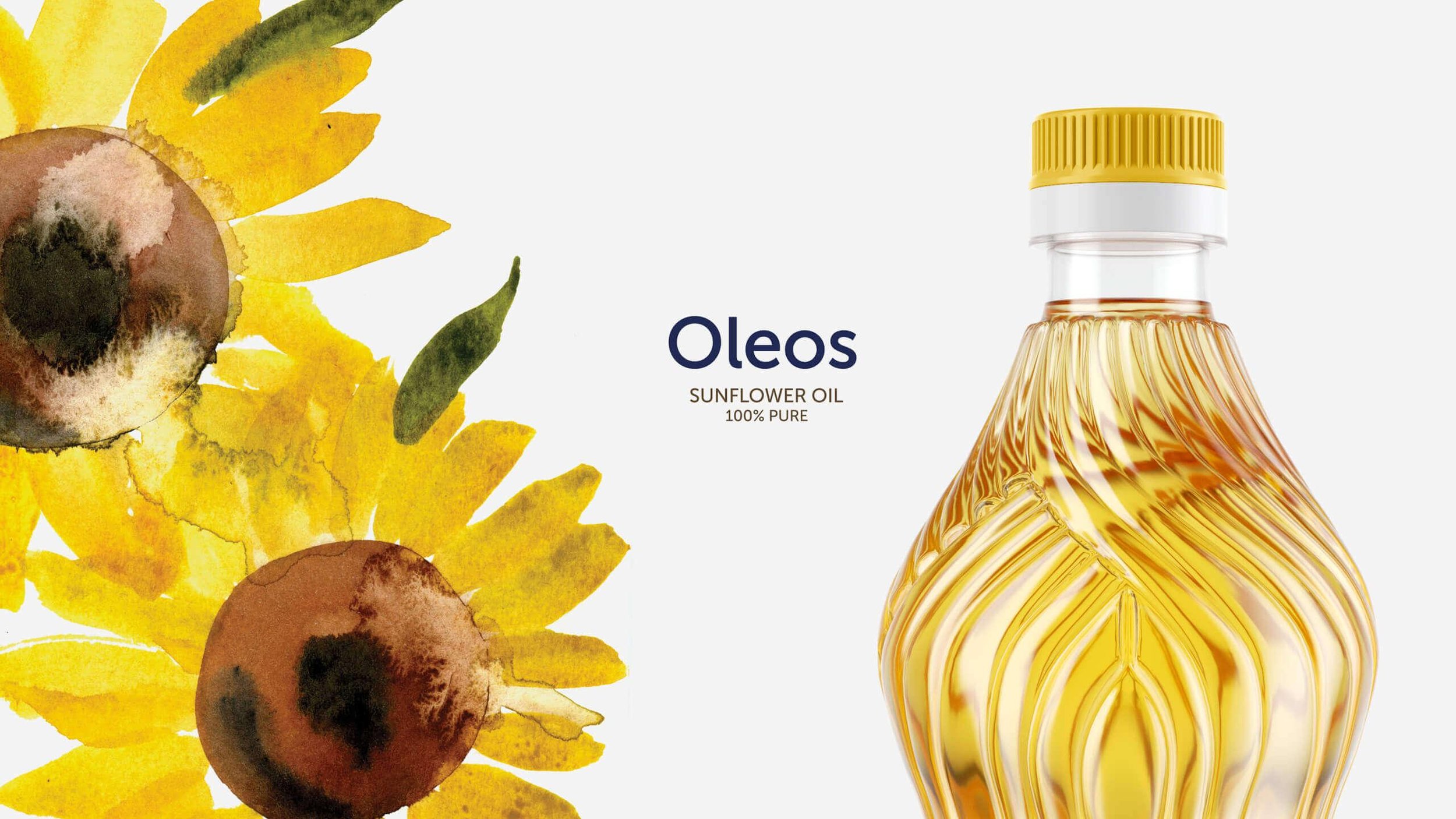
Sunflower oil Oleos
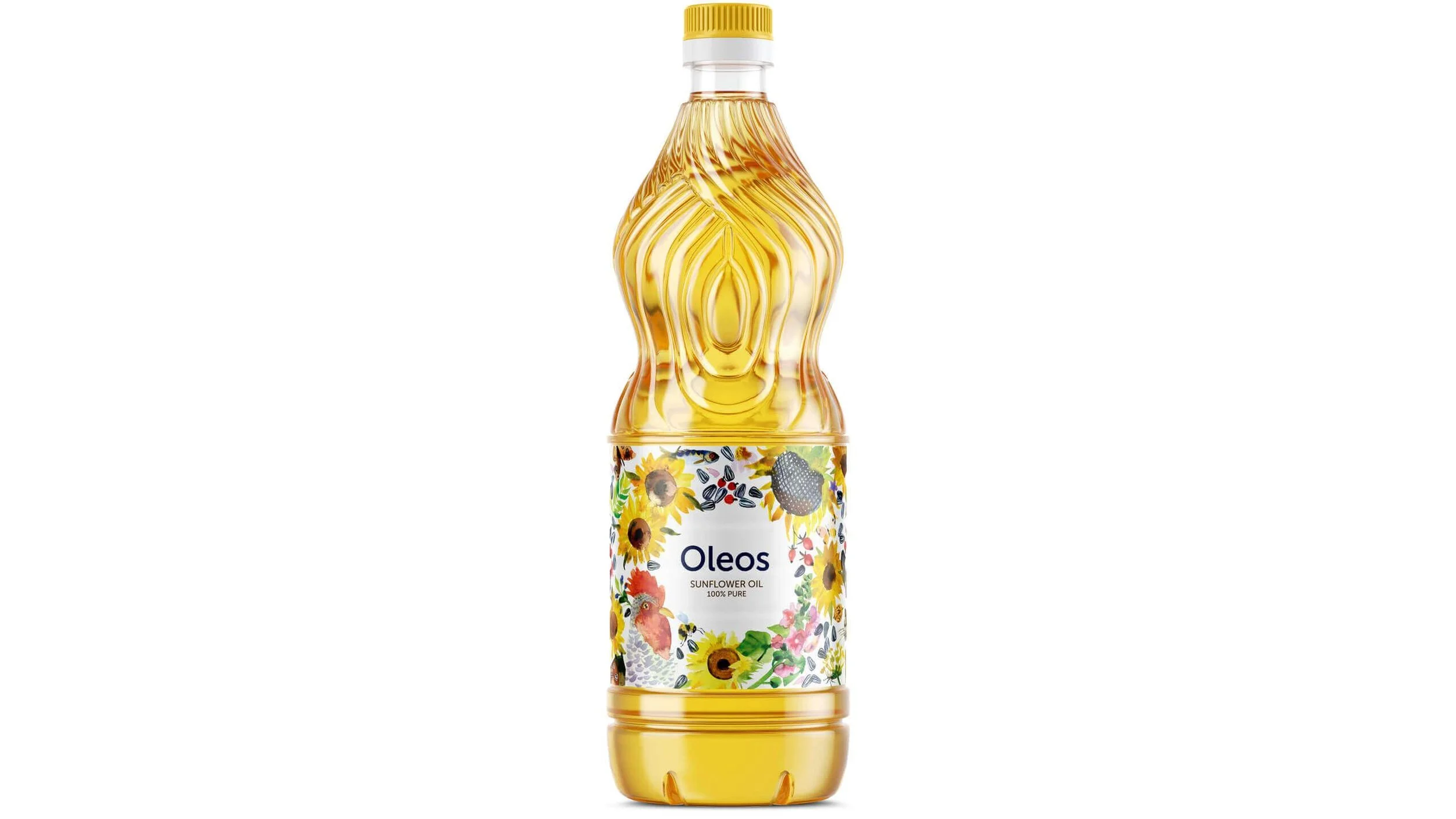
When designing the label for the exported sunflower oil, I was facing a challenge to depict the naturalness of the product, and to imply the geography of production without using any trite symbols. For the label I created a light watercolor illustration with a rooster and a rabbit settled in the reeds, heads of garlic and beans scattered all over, and a fish swimming by. The use of these surprising symbols, along with the traditional ones, made the imagery more emotional and vivider.
My role:
art direction, design;
management;
study of the competitive environment;
development of the character and mood of the brand;
composition scripts;
selection and monitoring of an illustrator;
layout;
print preparation.
Task
Develop a label for Ukrainian sunflower oil for export. The customer wanted the visual to hint that the oil was from Ukraine, but was adapted to the foreign market.
Target audience is very vague, it is women 18-65+.
Decision
The product design of this niche is very monotonous — a photo or photographic image of a sunflower and a capital logo. I wanted to deviate from this standard, but I couldn’t not use Sunflower at all. Therefore, I decided to portray him, but in a different style.
As a result, symbols appeared on the label that may hint at Ukraine, but they are woven into the overall composition and are perceived as part of the image.


Result
We only received a package of oil, which was an example of keeping the traditional theme of the illustration, revisited in an individual technique, which helped to distinguish the product on the full shelves of the supermarket.
In addition, the packaging served as an example of the design of a typical product and was the first request from all design communities, as well as the design was published by many specialized design resources, including thedieline.com, packagingoftheworld.com
