Shoe factory Bastion.
Ukrainian Design: the Very Best of
Kakadu awards
Every day we wake up in the morning and make the first step then another and another. Footwear is an integral part of our everyday life. Our world is huge and there are so many things to do - it would be irrational to waste time and effort for uncomfortable footwear. Bastion is a footwear of freedom despite of age and social status, footwear for each your step to be the most comfortable.
Task
I had to create a new brand identity for a long-established company whose design had become significantly outdated. Bastion is a budget footwear brand, and the client wanted the new design to look more premium without feeling intimidatingly luxurious. The goal was to make it modern and versatile, as the brand’s target audience spans a wide age range—from 18 to 65 years old.
Additionally, an important part of the brief was to avoid increasing the production cost of the packaging.
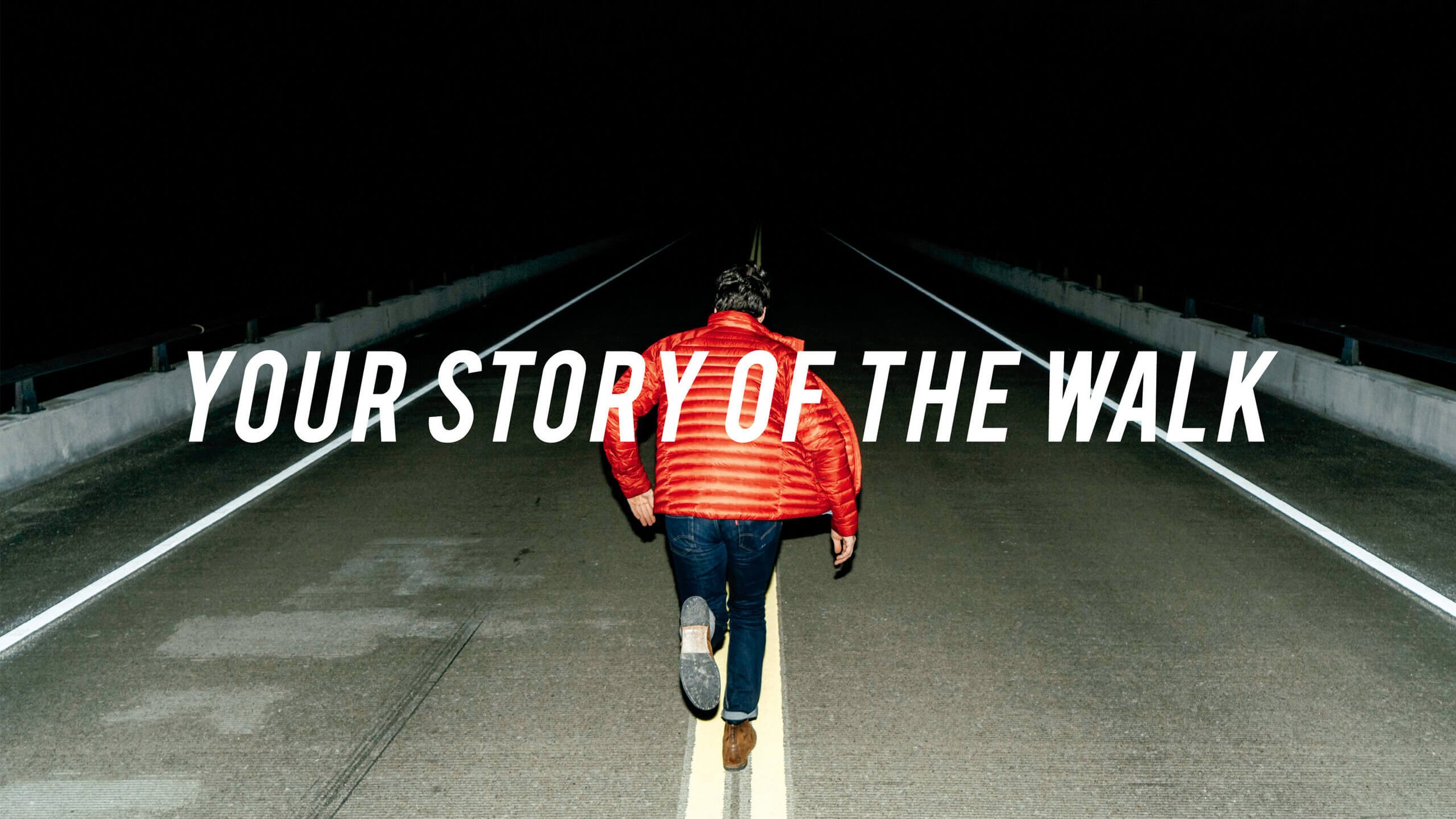
To give the brand more individuality and a distinct voice, I suggested adding a slogan “Your story of the walk”. The company frequently participates in themed exhibitions, and this solution helped expand its influence on the audience and made it easier for people to get acquainted with the brand.
Slogan


Tools
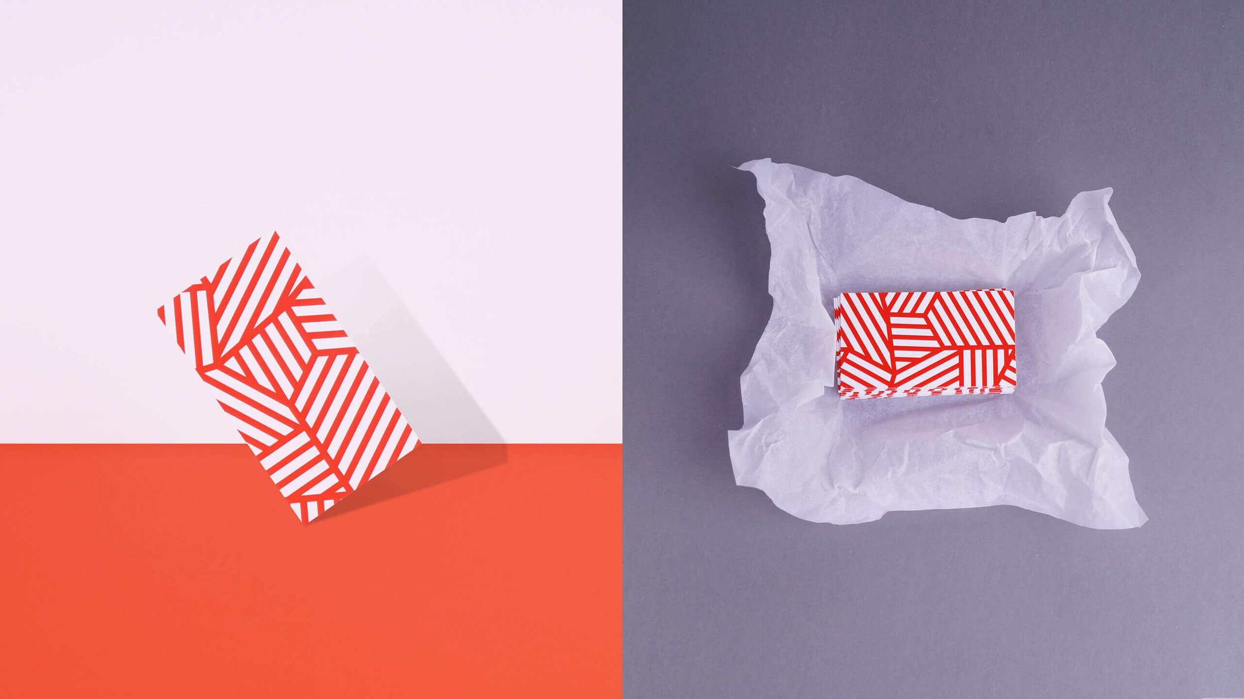
Several tools were used to create the Bastion brand identity: color—an active red combined with kraft materials; illustrations with unexpected scenarios for the footwear theme that reflect the company’s slogan; and textures that significantly enhanced the design possibilities.


Logo
I wanted to make the character the visual focal point, so I brought the illustrations to the forefront in terms of composition. Consequently, the role of the logo had to be subdued, making it a complement to the overall design. It was decided to create a lightweight typographic logo with a small symbol that symbolized the famous Mount Fuji and could be used independently from the text.


Prepress
The corporate identity has been fully implemented. Throughout the project, I actively participated in the selection of materials to bring it to life. The goal was to avoid additional expenses on consumables and ensure that the intricate and delicate design was reproduced without any deviations.
Expenses were reduced thanks to the monochromatic nature of the brand identity, and the excellent print quality achieved through color proofs and close collaboration with the printing house.
Result
The work was recognized by the juries of prestigious competitions such as the Red Dot Award, Golden Drum, PHNX, and Golden Drum. It has been featured in numerous industry publications, including packagingoftheworld.com and thedieline.com.
Furthermore, after conducting a survey, we found that 90% of our clients had a positive response. This positive feedback demonstrates the success of our work. We are delighted to see that our efforts in implementing the corporate identity have resonated well with the target audience. The high approval rate reflects the effectiveness and impact of the brand identity in connecting with and satisfying our clients.
