Supermarket Klass
There are a lot of supermarkets in Ukraine. They all are similar to each other big and light. Each of them has a lot of fish and vegetables, a large variety of soap and buns but in deed there is no supermarket itself.
This story is about one supermarket which doesn’t want to be as the next one with flat, boring taste. So it decided to start talking to its visitors. But how? In such a huge supermarket there are so many people and they all are different. How to be well-liked to everyone? If you cant get on everyone, let it be. I decided to create an intangible hero whose image will be created by his owner. For someone It can be a longtime school friend who they were fighting with using baguette swords or a girlfriend who was afraid of any bread crumb poising her neat figure and for someone it can be his granny who adds her own secret ingredient — love into every dish. The New Class represents associations which are particular for every customer. And they are absolutely about joyful and careful friend.

Task
Class is a well-known supermarket of the city, which is available in almost every district. They didn't have one single graphic, no common visuals, each of the stores was decorated for the most part in accordance with the preferences of the managing director.
My task was to develop an identity that would be focused on the target audience of 20-45 years old, people with an average income. The corporate identity was supposed to unite all current and future stores, be timeless and interactive.
Desision
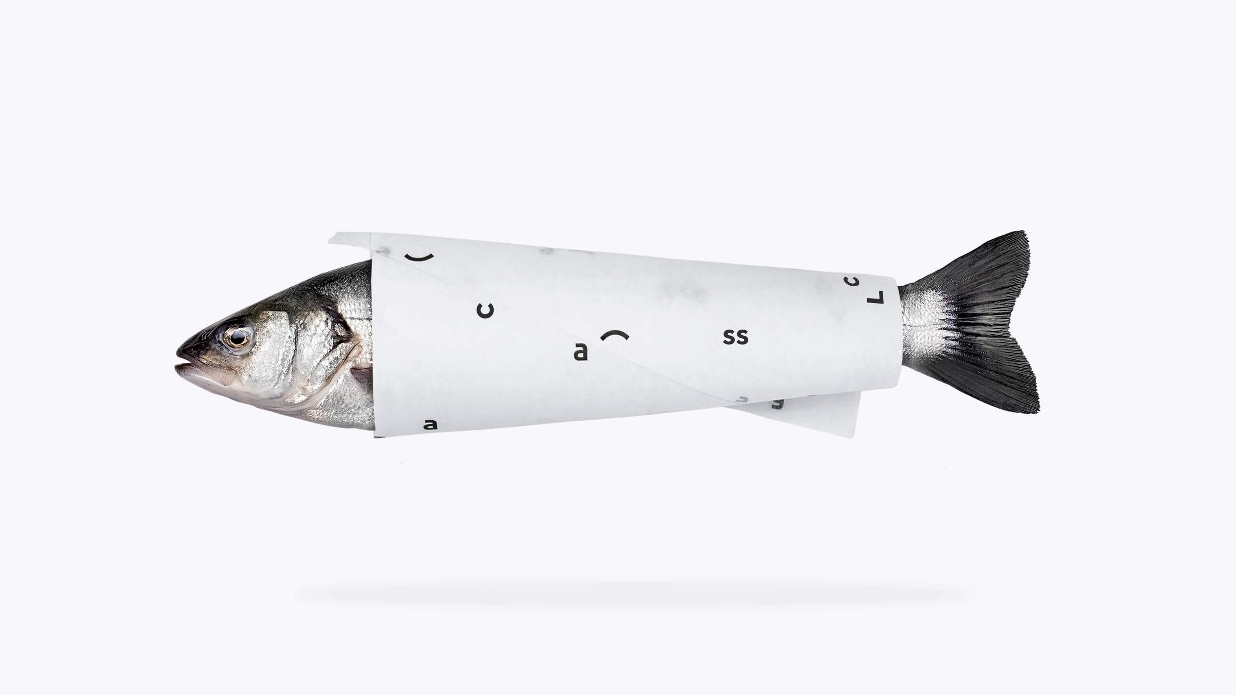
Despite the client not making a specific request for it, at first I suggested updating the logo as the previous one had poor geometry and outdated aesthetics. Translated from Ukrainian, Class! — is a positive exclamation denoting delight. Therefore, I suggested using a modern font style and complementing the logo with a smile.
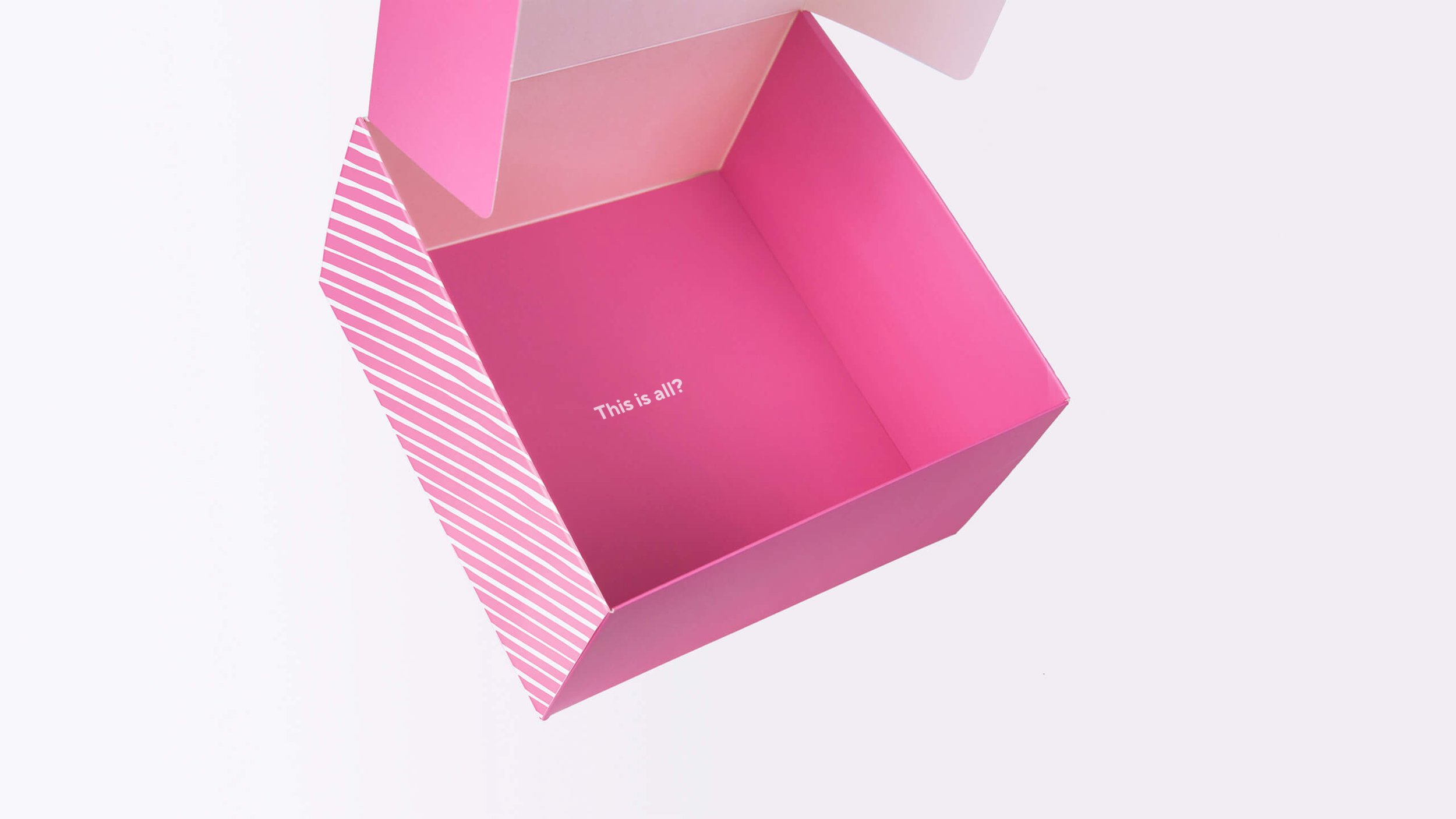
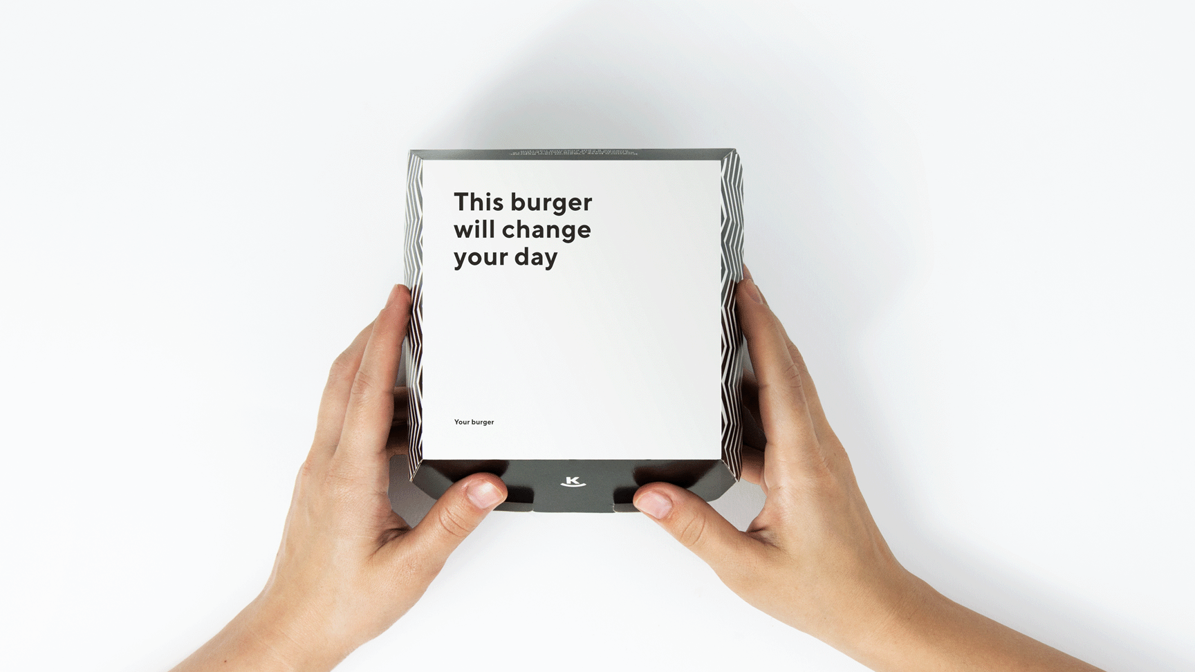
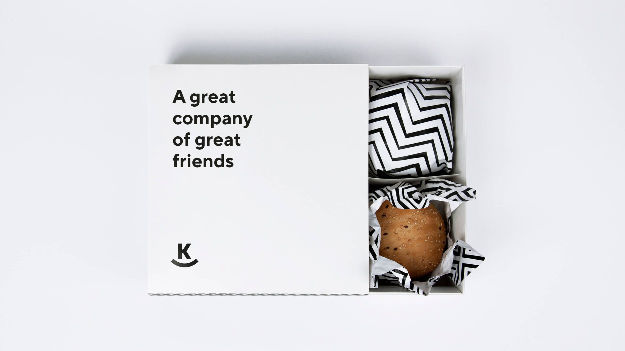
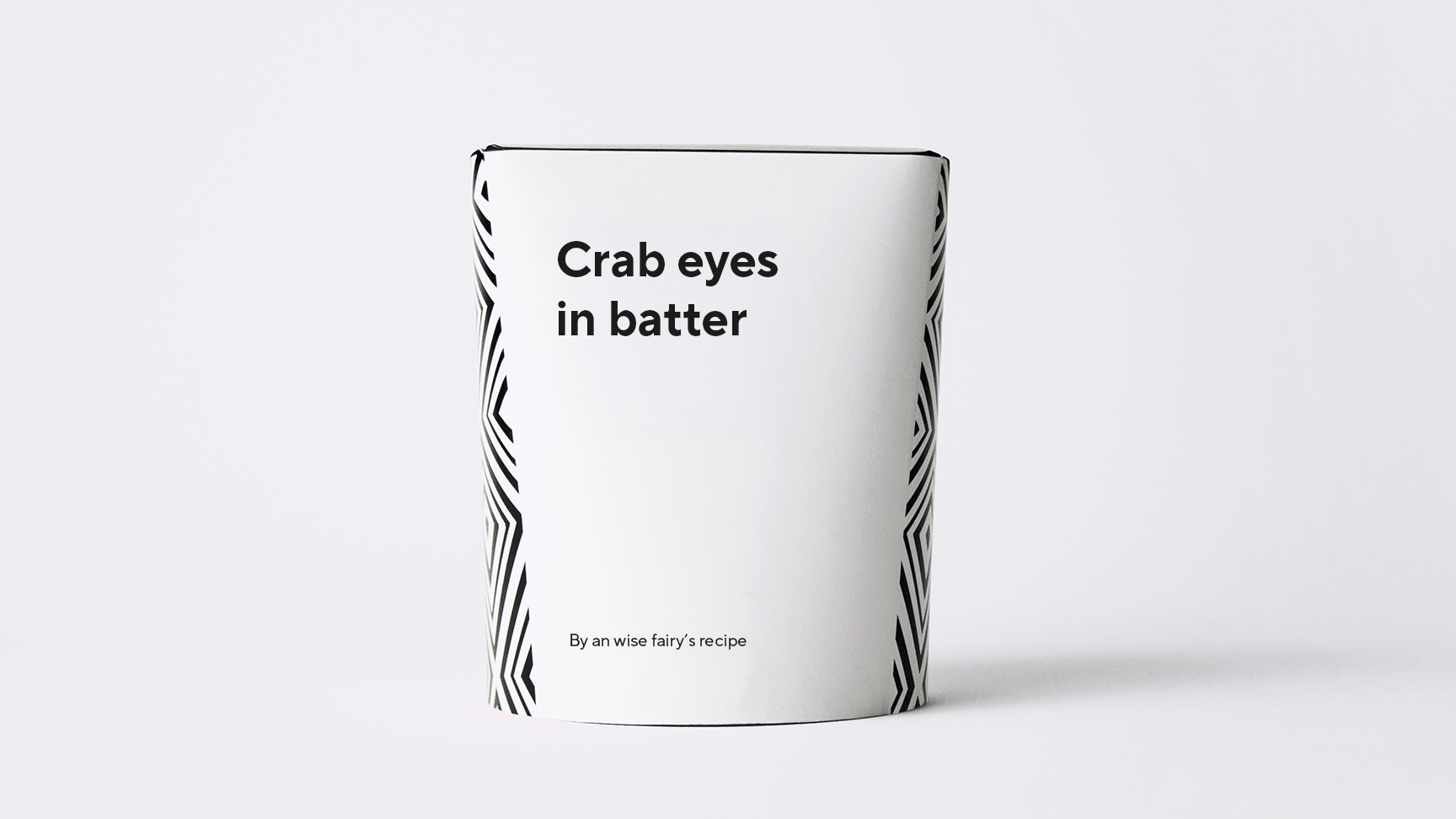
I wanted to create a friend for everyone who wakes up in the morning, or in a hurry for lunch, or tired in the evening, would go to the supermarket and enjoy being there. Thus, the idea was born to make the corporate identity as simple as possible in terms of design, but very rich in meaning. Each item of identity that the consumer came into contact with carried a funny or amusing message.


Volume
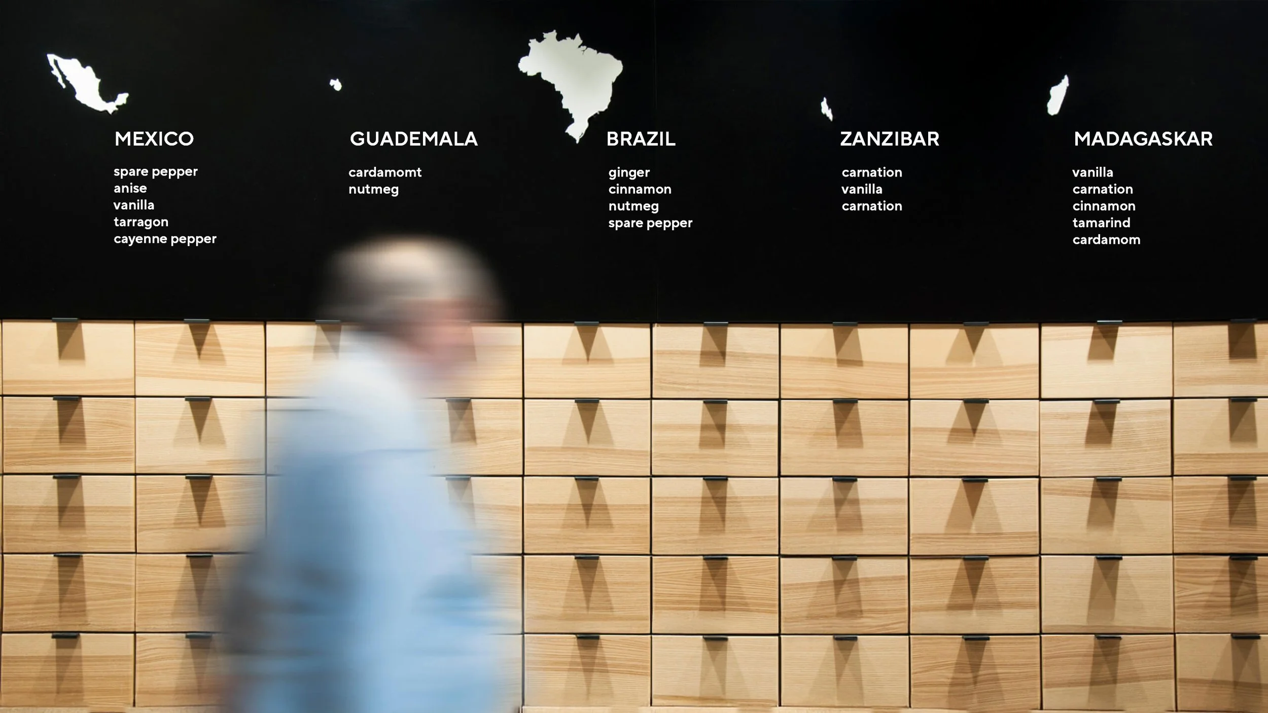
This is an incredibly big project. I came up with more than 170 phrases, which were updated in a certain period of time so that the consumer does not get bored. More than 400 items of corporate identity were created, including advertising layouts, packaging, uniforms, navigation, checks, menus, interior decorations.


Interesting
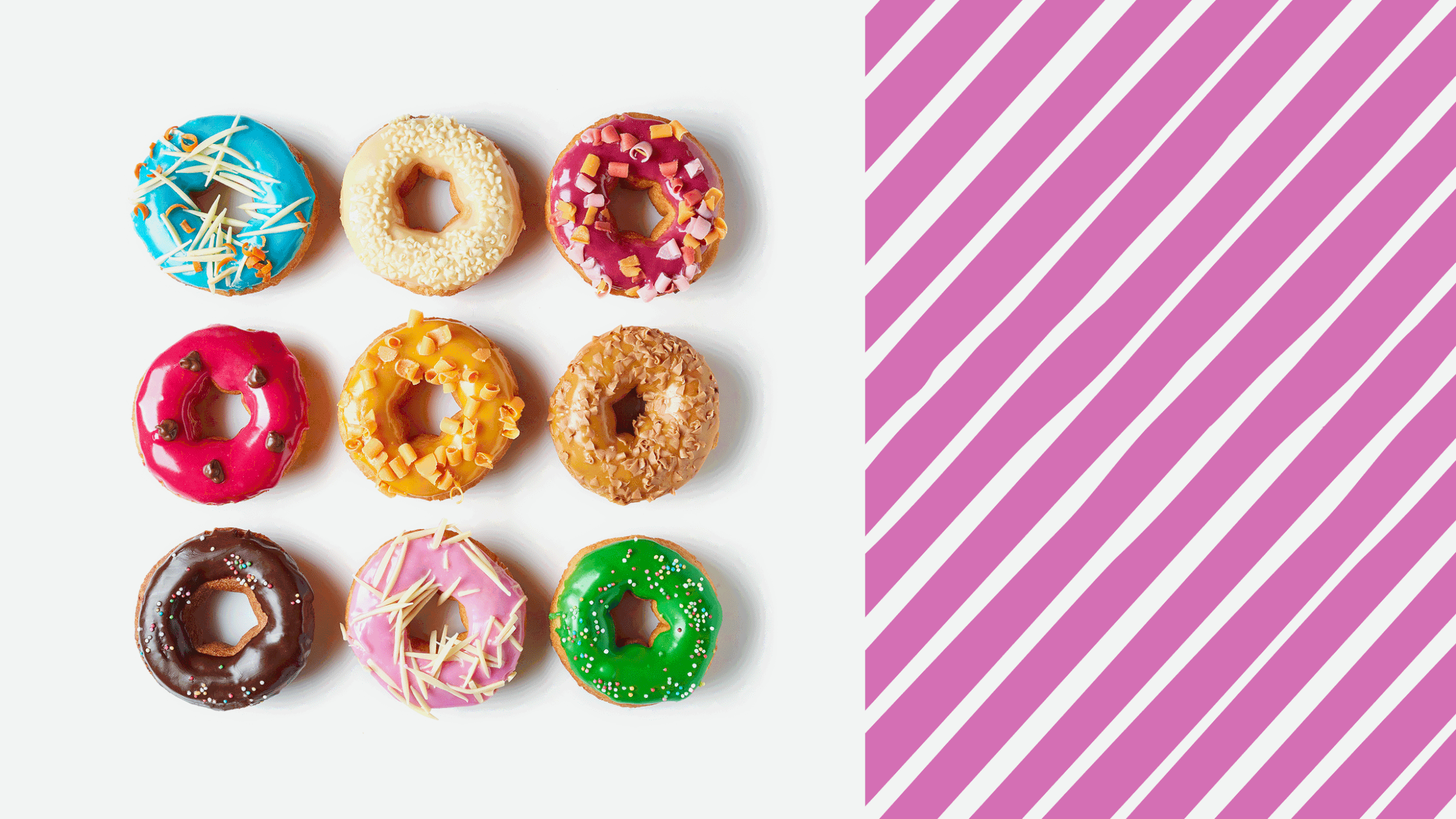
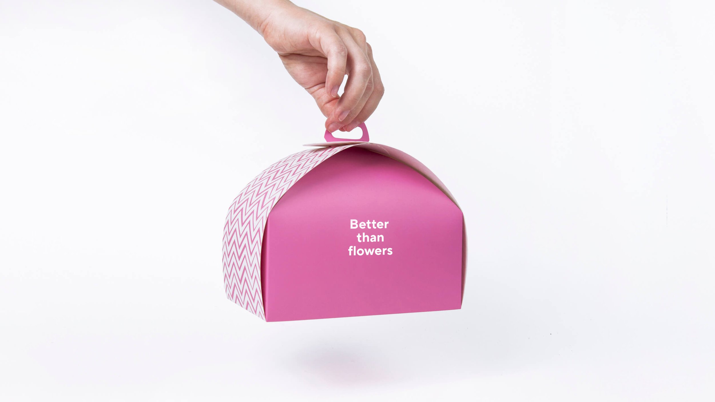
Supermarket Klass is not just a grocery store; it’s also a restaurant and a signature bakery. To differentiate these departments, I used color. Red represents the main supermarket, black highlights the restaurant located right in the center of the store, and pink was chosen for the bakery to emphasize its sweet and cheerful vibe.
This approach allowed for clear differentiation of the departments while maintaining visual cohesion. Additionally, all three locations were given a unified identity, significantly reducing the budget by limiting the packaging design to just one color per department.


Problem
The class is a large supermarket with a vast amount of packaging and other attributes. The client wanted the brand identity to encompass as many objects as possible, but was concerned about the expenses.


Result
We got a corporate identity that can be updated and transformed over time or send new and new messages depending on the occasion or new location.
I managed to solve the main and most difficult task for this niche — to create a simple in technical implementation and emotional corporate identity.
For a long time after the opening of the first store with a new identity and after the opening of each subsequent store of the network, we observe a personal response in social networks using funny inscriptions. The indicator of customer loyalty and sales growth was significantly increased, in addition, I would like to note that this client has moved into the category of permanent ones.