Density One
Identity elements
About Density
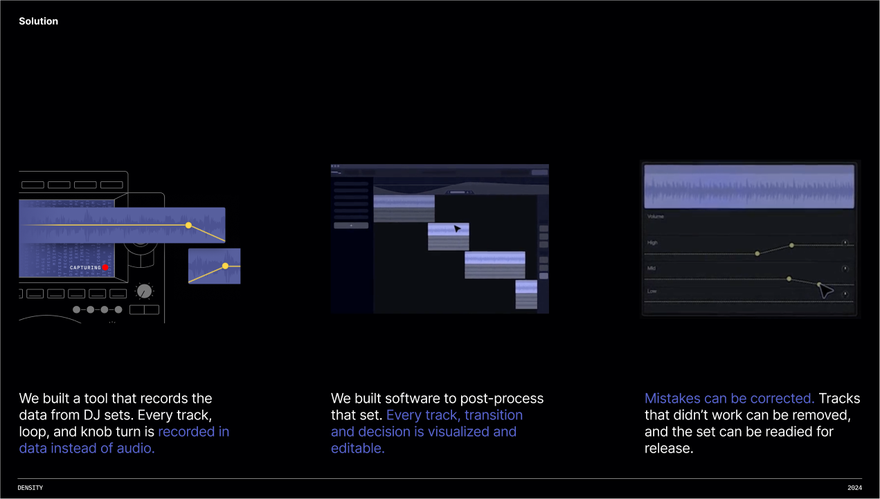
Density products revolutionize DJ sets by providing users with precise tools for recording and editing their performances. Instead of recording audio, Density captures data from DJ decks, including every cue, loop, and knob twist. This allows for non-destructive editing of transitions, EQs, filters, and effects within the Density app, preserving high-quality tracks without distortion from DJ hardware.
Density offers two solutions: software and hardware.
Software: The standalone Mac application allows users to record live sets and enhance studio tracks without DJ decks. It includes transition presets, EQ automation, mixer effects, and a LUFS meter for consistent volume. The high-quality limiter optimizes sets for platforms such as SoundCloud.
Hardware: The Density hardware device captures DJ sets in clubs and festivals. By connecting to decks and mixers, it records every detail of the performance, creating a recording that resembles a text document rather than a photocopy. The recording can be easily exported and edited in the Density software after the performance.
I’ve been involved in various aspects of the Density project, such as redesigning the identity and character, creation identity system, templates, guidlines, package and improvement and harmonization of the overall visuality.

Work process
I had the exciting challenge of introducing a revolutionary new brand and product to its target audience. To achieve this, I undertook an extensive creative process, starting with the development of two distinct visual identity lines. I needed to study the designs of existing products in the industry, identify their shortcomings, and create a design that highlighted the product’s uniqueness without intimidating the audience with its revolutionary nature, as the product was entirely new.
The first line was crafted to capture and convey the unique mood of the brand, deeply inspired by the dynamic and vibrant culture of DJs and electronic music.
The second line was tailored for the formal presentation of the product, aimed at appealing to sponsors and investors. This design emphasized professionalism and innovation, ensuring that the brand's revolutionary nature was communicated clearly and compellingly.
Of course, these two visual lines had to be unified by common visual anchors.
The birth of a character
To introduce the audience to the new product, we decided to personalize it. I was provided with a character sketch, which I needed to refine and develop further to use as a foundational element in the brand identity.

Stakeholder
“We need to build a bridge to the whimsical, creative audience of DJs, adding drive and chaos…”

We called him Gulp
A character is always an emotional part. I was given a sketch to refine, into which I infused the chaos and energy of nightlife through a chaotic texture, bold, rough outlines, and an active white border for practical placement on any background.


Head of design
“We need more illustrations, we even need our own illustrative fonts ...”

Despite the apparent chaos, all designs were organized into a visual system. Several variations of the character, Gulp, were created: full-body, just the head, with or without texture, a smoother outline for vector use, and various facial expressions for presentations and social media illustrations, a bunch of additional illustration, handmade font, and regular describing of design system as colors, fonts, sizes. All of this was compiled into a guide.


let's move on to social media
Head of Design
“We need to add more mood DJ culture…”
Stakeholder
“We have to show that this is a product for recording and editing music… “
Head of Design
“This shouldn't look like a technical page…”
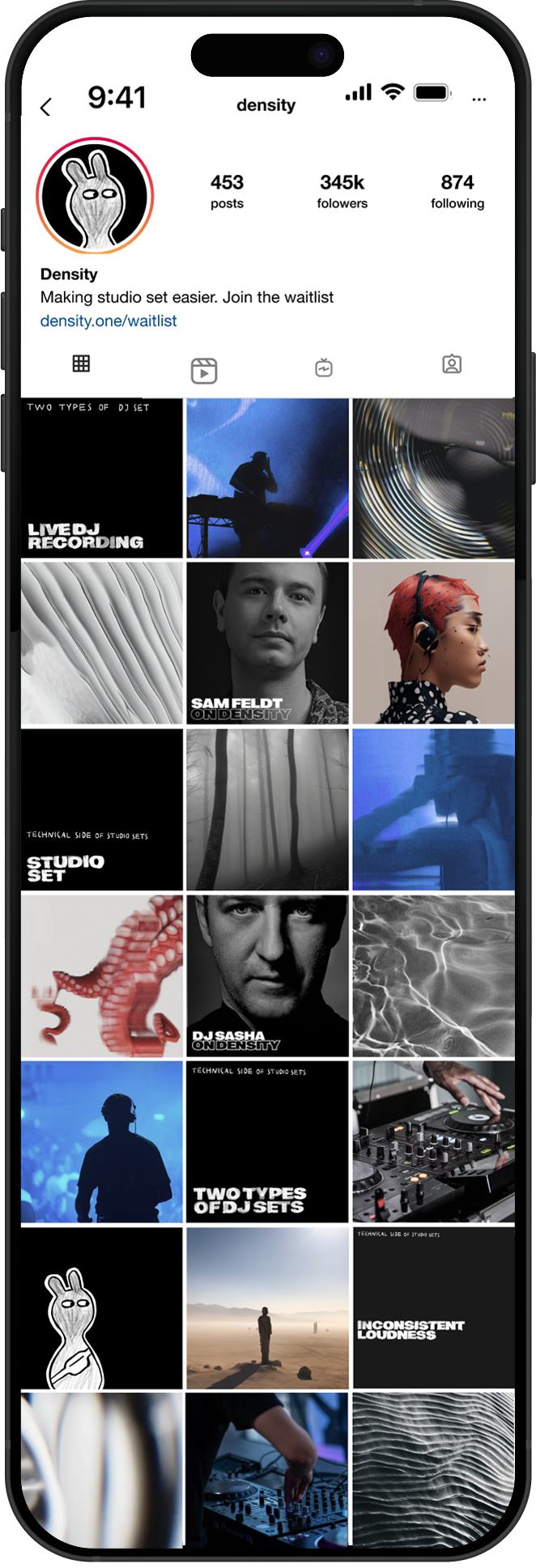


To emphasize the vibe of the new brand, I added a lot of distinctive visuals to Instagram. In addition to a cover design system, a specific color palette, and a rhythmic scheme for alternating images in the feed, I generated numerous thematic visuals using artificial intelligence.
When designing social media, the mood, visual message, and overall page aesthetic account for 90% of what truly captures the audience's focus. This is especially important for new products —before engaging viewers with technical features, it's essential to grab their attention first.
Today, using artificial intelligence is still somewhat of a gamble, with uncertain results. However, I have successfully "tamed" MidJourney, RunWay and ChatGPT to create images and videos with the precise, unique mood I need. By crafting specific prompts and compiling them into a guide for creating Density images, I can ensure consistency and creativity in visual content.


Had fun? Now let's move on to the technical part
Technical illustration
Since the product is entirely new and has no market analogs, in addition to establishing an emotional connection with the audience, it was essential to explain how it actually works. For this purpose, technical illustrations were created, showcasing all the necessary technology and steps required to connect the device. These illustrations were used in the app, the device manual, and presentation explainers.

I have developed over a dozen explainers, sketches for videos, and presentations for companies like Apple and Spotify.


let's talk a little about Hardware

Density hardware
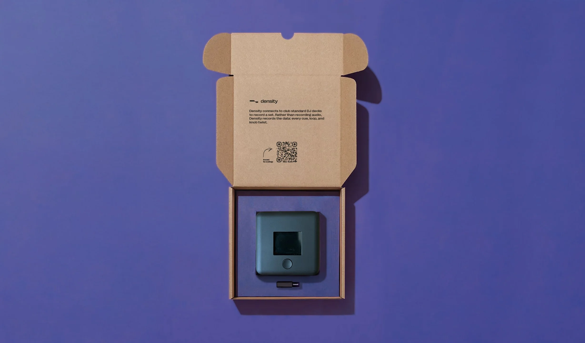
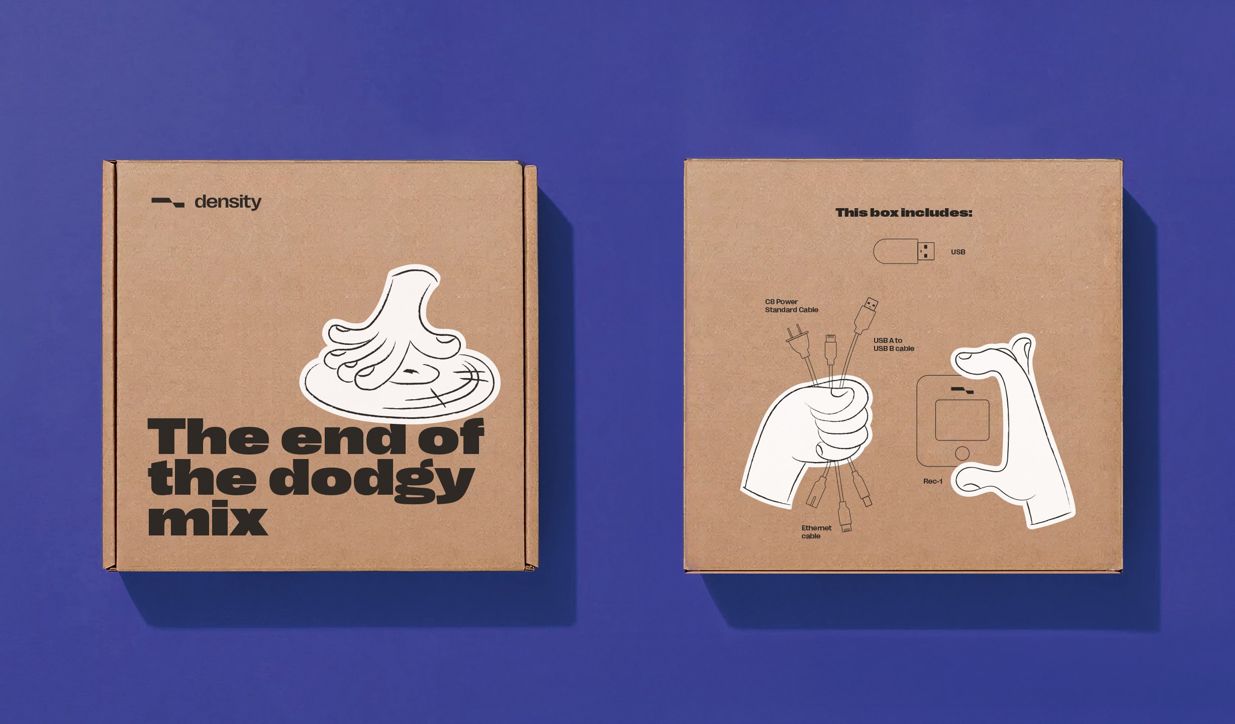
A device that had never existed before, completely revolutionary, and I was tasked with designing its packaging.
The device is quite heavy, so it was necessary to select appropriate materials and incorporate additional reinforcement ribs. Besides the device itself, the packaging needed to include various items for proper connection of Density to other equipment: a manual, a storage pouch, a long cables, adapters, and a USB flash drive, with a special emphasis on the inclusion of these components.
Head of Design
“It needs to look friendly …”
Stakeholder
“Production should not be expensive … “
Head of Design
“We have to put everything in one small box …”
Decision
I designed custom packaging made from dense kraft cardboard, featuring an additional reinforcement rib that acted as a holder for the device and the USB flash drive while separating the main components from additional technical accessories. This solution ensured the safe storage and transportation of the heavy device while visually highlighting it and the flash drive. The packaging utilized simple, uncoated cardboard and only three colors, which helped keep production costs low.

Result of work

